During the last year Mattel corporation challenged me and the Faculty of
Architecture of the University of Porto to organize a design
competition for the new Barbie Dollhouse. In 2013 Barbie doll was looking for a new house (that was the 2013 Barbie's story...) and Mattel knew about my investigation and my course
architectural toy design at FAUP So they mail me and I thought was a good opportunity for students thinking about a very particular object as a dollhouse. So we create a competition that, for logistical reasons, was limited only to
FAUP students.
The jury was composed by Prof.ª
Maria Madalena Ferreira Pinto da Silva (From FAUP), Prof.
Juan Bordes (From Escuela Técnica Superior de Arquitectura de Madrid), Arqº José Mateus (From
Trienal de Arquitectura de Lisboa &
ARX Portugal), Arqº
Virgínio Moutinho and Sally Eagle (from Mattel corporation).
Many delivered proposals proved great creativity and very good design skills. Some models was very well produced, with good techniques and details.
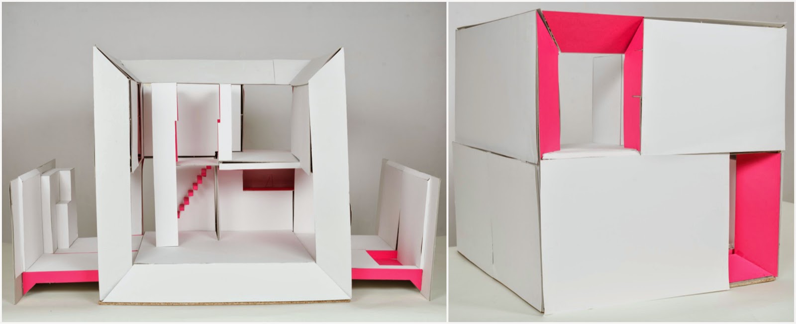
The three first proposals (that deserved the prizes offered by Mattel Company) represent three different dollhouses design paradigms: the first for its flexibility and imagination potentiality, the second for its ability in space creation and the third for its possibility of forms manipulation.
I'm now thinking about a larger scale competition for the next year...any suggestions?
Here some proposals:
 |
| 1º classified |
The first place went to this dollhouse that leave the kids totally free to custom the play environment. It is a simple scenario where you can use photos, magazine pages or even sketches to crate a familiar or a completely new layout. Behind that it is both for male or female use because you can create a dollhouse or a garage, a space station or a natural surrounding. It is also the easier and cheapest model and idea.
 |
| 2º classified |
The second place went to a proposal that bet on space creation. This cube can be opened creating several different rooms and outside spaces. Its architectural language is quite contemporary and it is big enough to allow kid "feel" the space proportions and characteristics.
 |
| 3º classified |
The third place is almost a wire-frame structure that can be manipulated creating several different shapes and houses. Beyond that kids can put objects or setting in order to create different environment. It is quite elegant and simple and, for that, with a great creative potential.
 |
| 4º classified |


